

Los California Tacos

My role
UX designer producing an app for Los California Tacos from conception to delivery. Conducting interviews, paper and digital wireframing, low and high-fidelity prototyping, conducting usability studies, accounting for accessibility, and iterating on designs.
The Goal
Design an app for Los California Tacos that allows users to easily order and pick up hot, delicious tacos.
Understanding the User
I conducted interviews and created empathy maps to understand the users I’m designing for and their needs. A primary user group identified through research was working adults who don’t have time to cook meals.
This user group confirmed initial assumptions about Los California Tacos customers, but research also revealed that time was not the only factor limiting users from cooking at home. Other user problems included obligations, interests, or challenges that make it difficult to get groceries for cooking or go to restaurants in-person.
Pain Points
Time: Working adults are too busy to spend time on meal prep
Accessibility: Platforms for ordering food are not equipped with assistive technology
IA: Text-heavy menus in apps are often difficult to read and order from


Starting the Design
Wireframes
Taking the time to draft iterations of the app home screen on paper ensured that the elements that made it to digital wireframes would be well-suited to address user pain points. For the home screen, I prioritized a simple and easy ordering process to help users save time.

Low-fidelity Prototype
Using the completed set of digital wireframes, I created a low-fidelity prototype. The primary user flow I connected was building and ordering multiple tacos, so the prototype could be used in a usability study.

Usability Study Findings
I conducted two rounds of usability studies. Findings from the first study helped guide the designs from wireframes to mockups. The second study used a high-fidelity prototype and revealed what aspects if the mockup needed refining.
Round 1 findings
Users want to order tacos quickly
Users want a way to customize multiple tacos at once
Users want a pick-up option
Round 2 findings
The menu wasn’t clear that drinks were also available
Users want a way to remove items from order before checkout
Refining the Design
Mockups
Early designs allowed for some customization, but after the usability studies, I added additional options to the menu cards. I also revised the design so users see all the customization options when they first land on the menu screen.
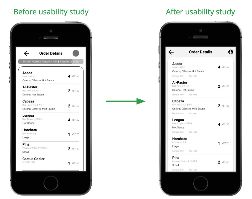
The second usability study revealed frustration with order editing and the checkout flow, I added an option to remove items and add notes to the order detail screen.

High-fidelity Prototype
The final high-fidelity prototype presented cleaner user flows for building an order and checkout. It also met user user needs for a pick-up or delivery option as well as easier customization.
Accessibility Considerations
Provided access to users who are vision impaired through adding alt text to images for screen readers.
Used images and icons to help make experience more accessible and enjoyable to all users.
Labeled translations for each menu item to help users who speak other languages better understand the ingredients.
Takeaways
Impact
The app makes users feel like Los California Tacos really thinks about how to meet their needs.
“The app made it really easy to build my own tacos. I’d definitely use this next time instead of GrubHub or Uber Eats!”
What I learned
While designing Los California Tacos app, I learned that the first ideas for the app are only the beginning of the process. Usability studies and peer feedback influenced each iteration of the app’s designs.
Next Steps
Conduct another round of usability studies to validate whether the pain points users experienced have been effectively addressed.
Conduct more user research to determine any new areas of need.


Thanks for scrolling all the way down! If you’d like to get in touch, my contact info is provided below.
< Zest
Mimic >